Fix Uneven Product Image Grids
See why identical image dimensions can still produce uneven product sizes, using two downloadable exports of the same photograph.
Compare the subject, not just pixels
If two files have the same width and height but the products look different in size, inspect the space around each subject. Equal canvases do not equalize the objects inside them. A source with more empty background produces a smaller-looking product when the whole photo is fitted into the same frame.
The paired example uses one photograph at two scales on identical 800 × 800 canvases. This isolates source occupancy from product differences. It is a controlled reference example, not a screenshot of a Shopify theme.
Same canvas, smaller subject
Both files are 800 × 800. The second puts a 400-pixel-high source into the same square. A source with extra space can therefore make a collection look uneven even when every uploaded file has identical dimensions.
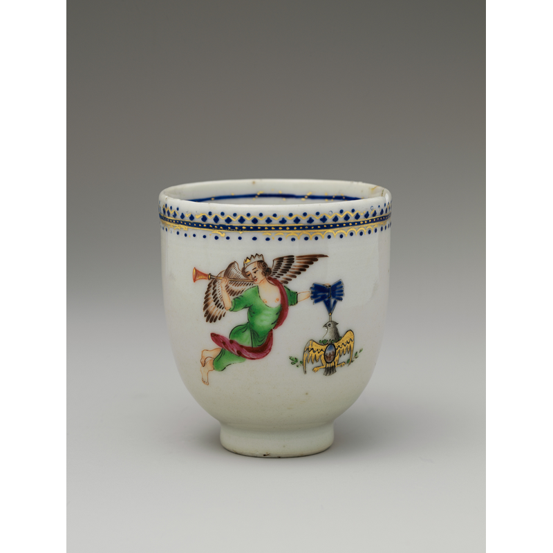
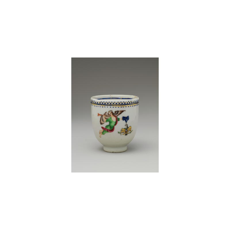
Image sources and reproduction
Photographs: Coffee Cup, The Metropolitan Museum of Art; Coffee cup and coffee bean, mcfoodie. Both are CC0. They are third-party test material, not photographs taken by this project. Pattern, text, transparency and noise fixtures are generated tests.


Measured 2026-10-20 with sharp 0.35.4, libvips 8.18.6, Node 24.13.1. Download all dimensions, byte counts and SHA-256 hashes. Reproduction script.
Find which layer differs
Start with the downloaded images outside the storefront. If the products already look uneven there, adjust the source framing. If they look consistent outside the store but different inside it, inspect the theme's image ratio, crop, container dimensions and responsive settings.
A wide or tall product can legitimately occupy a different amount of visual space. Matching every object to the same height may exaggerate a tiny accessory beside a large item. Choose a consistent presentation rule for a product family rather than forcing unlike products to look physically identical.
- Open two representative source images at the same display size.
- Compare the subject's top, bottom and side margins.
- Normalize the source framing where appropriate, then export to a shared aspect ratio.
- Inspect the resulting grid inside the actual storefront theme on a phone and desktop.
Choose a useful canvas
A square canvas is convenient for many product groups, while tall or wide objects may work better in another ratio. The current Shopify image requirements and square-image recommendation are linked in the separate platform reference. Choose output resolution after deciding the framing; a pixel recommendation does not select a composition for you.
Image Prep can fit or crop a complete source rectangle. It cannot detect the product boundary or automatically trim empty background. To standardize subject scale, adjust the original in an editor with manual crop or positioning controls, then run a small export test.
Check the finished collection
Shopify documents that themes can request consistent CDN sizes and that different image sizes are created for different theme areas. A shared upload ratio therefore helps but does not control every displayed crop. Check both collection and product pages after saving a theme change.
If a theme setting solves the display issue, avoid destructively recropping every original. Keep the originals, record which presentation setting changed, and test a portrait and a landscape image before processing the remaining catalog.
How this guide was made
Written from the documented sources and downloadable examples on this page. Reference-encoder results explain the file decisions; the final browser output and destination preview still need checking.
Reference: Shopify: product images, collection ratios and theme behavior